 We started a conversation yesterday about direct mail when I posted “What’s in your mailbox? Part 1“. We looked at a political fundraising piece that showed up in my mailbox from Michelle Obama and dissected it. Today, we’re going to my mailbox and pulling out a newsletter that I recently received from Michael Noland, who is my state senator.
As I said yesterday, I believe “the average American can become educated about what works and what doesn’t work when it comes to direct mail if they only pay attention to what is being sent to them, what they are opening (or not opening), and how and what they’re reading (or not reading).”
So, let’s open this newsletter and see what we’ve got.
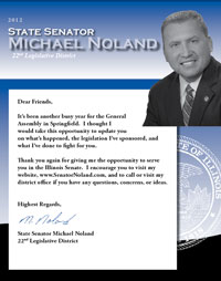
The front page is actually quite simple. It contains a two paragraph letter from the senator explaining that the legislative session that just ended was busy. It essentially invites me to open the newsletter for an update on “what’s happened, the legislation he sponsored, and what he’s done to fight for me.”
Hmmm . . . the feel and tone of the letter makes this newsletter seem more like campaign literature. To be honest, I am hesitant to turn to page two; however, I will do so for you, my dear reader. 😉
 This is a four page newsletter. So, when I turn the page I am looking at the middle of the newsletter — pages two and three. Here is what I am starting to notice:
- Lots of pictures (four to be exact)
- 18 point font headlines and 14 point news copy
- Headlines are in color
I suspect the senator is concerned about senior citizens not being able to read his newsletter, which is why everything is so big.
You’ve heard it a million times . . . a picture is worth a thousand words. All of the pictures are of the senator doing something. He is talking to a concerned older couple. He is delivering the commencement speech at Elgin Community College (ECC). Since most people won’t spend more than as few seconds with this mail piece, pictures become very important in conveying quick information. In this instance, the senator obviously is trying to send the message that he is working hard on your behalf.
 In a previous life, when I ran a weekly newspaper, we learned from reader surveys that big pictures and headlines were the first thing to which people paid attention. If the picture or headline was interesting, then they would make the decision to read the article. It is obvious that this newsletter is designed with thatsame principle in mind.
I don’t believe people read much anymore, which is an ironic observation for a blogger like myself to make. What I do believe is that people skim, and I suspect the senator believes the same thing when I look at his newsletter copy.
There are seven mini-articles with topics ranging from public employee pension costs and healthcare to child welfare and veterans. Nothing is more than one paragraph in length. It is written in the first person and very action oriented with phrases like:
- “I co-sponsored . . .”
- “I fought . . .”
- “I believe . . .”
To translate all of this into non-profit terms, the senator is demonstrating to the voting public the return on investment for your vote. This is simply the senator stewarding voters in much the same way you steward your donors. The only difference is that you want your donors to renew their financial support and the senator wants people to vote for him again.
Let’s turn the page and look at the back of the newsletter.
I am invited to stay informed and encouraged to routinely visit the senator’s webpage for updates, news and email access. There is a monstrously large QR code on the page that I can scan with my cell phone, and it will take me to his website instantly.
Here are a few best practices that we can take away from our dissection of the senator’s newsletter today:
- Be mindful of font size, especially if your donors are older.
- Use lots of pictures to communicate information quickly.
- Use color and big headlines to make things pop off the page and generate interest in reading the newsletter copy.
- People skim . . . so keep stgories short and snappy. Short sentences and very few paragraphs.
- Cross-channel marketing . . . use the newsletter to drive people to your website where you can spend more time with them and go into more detail.
Personally speaking, I really dislike newsletters like this one. I believe that the typical slick/glossy, one color, four page newsletter is a thing of the past. I really liked the previous piece sent out by the senator. It was a one page bulletin that looked like what Penelope Burk describes in her book “Donor Centered Fundraising“.
If you are interested in learning more about what donor bulletins looks like and why they are more preferred by your donors, then I suggest that you go back and read the following three blog posts from last year:
If you want to see a copy of Senator Noland’s most recent newsletter so that you can compare it to what you read in these three donor-centered newsletter posts, then click here.
Does your non-profit organization use a newsletter to steward supporters and donors? Are you happy with it? What have you found in your experience works or doesn’t work? Please use the comment box below to share with your fellow non-profit professionals.
Here’s to your health!
Erik Anderson
Founder & President, The Healthy Non-Profit LLC
www.thehealthynonprofit.com
erik@thehealthynonprofit.com
http://twitter.com/#!/eanderson847
http://www.facebook.com/eanderson847
http://www.linkedin.com/in/erikanderson847

2 comments