 For the last few decades, the non-profit sector has been focused on data in an effort to convince donors to continue their philanthropic support. I still remember being a new executive director sitting in my first United Way meeting and learning about constructing logic models and differentiating between inputs, outputs, outcomes and pre- and post-test survey tools. All of this was piled on top of a slew of other data metrics my national office was asking for such as:
- overall organizational membership
- average daily attendance
- member demographics (e.g. gender, age, ethnicity, zip code, household income, etc)
- employee turnover
- how many members attended 52 days or more per year compared to 105 days
- And on and on and on (seriously, the report was 35 pages long)
While I understood information was powerful, especially with regards to management and decision-making, it was mind-numbing to me the first time I heard someone advocate for total transparency by sharing all of this data with donors.
My immediate reaction was:
- Of course, donors have the right to see what their investment is producing!
- But seriously . . . isn’t a data dump via the annual report, website, newsletter, impact reports, etc. counterproductive and confusing for donors?
From that starting point in the Spring of 2000, I began my journey and life-long struggle with becoming a donor-centered fundraising professional.
I must confess this quest for the holy grail of perfect donor communications is ongoing.
For the last few days, I’ve been preparing for next week’s Boys & Girls Clubs of America National Conference in New Orleans. In addition to beautifying my exhibitor booth, I’m refreshing The Healthy Non-Profit‘s marketing materials. In the process of doing this, I decided to take a stab at producing a few infographics related to some of the services I am trying to highlight.
I recently got bit by the infographic bug because two of my capital campaign clients are really good at using these tools. I just love how easy they make it look. I also became a fan after I started researching why these communication tools are so effective.
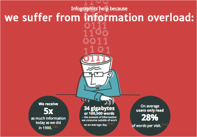
Check out the following cute infographic that helps make the case (Source: CopyBlogger post titled “25 Ideas to Transform Ho-Hum Infographics into Something Extraordinary,” written by Barry Feldman):
As I set out to create my first few infographic handouts for my conference booth, I must admit it wasn’t easy. However, I found a few great online resources that helped me get over those first few hurdles. In the spirit of collaboration, I thought I should share:
- Donna Moritz’ blog post titled “7 Super Tips for Creating Powerful Infographics” on the Entrepreneur blog
- Wick Marketing’s “The Power of Infographics“
- Allison Gauss’ “10 Nonprofit Infographics that Inspire and Inform” on Classy Blog
- Picktochart, which is an online infographic generation tool (Note: I subscribed to the free version and liked this site’s intuitiveness. I might even upgrade into one of their pay-packages.)
It has been a while since I’ve served on the front line of a non-profit organization. I’m sure online tools like these are now more common. What does your organization use to distill its data and information into easy-to-digest, bite-size donor communications pieces? Please scroll down to the comment box and share your thoughts and experiences. We can all learn from each other.
Oh wait . . . before you leave . . . it is important to note that there are some very smart fundraising professionals and bloggers who are NOT on the bus when it comes to sharing data with donors during the solicitation stage of the resource development process. While they typically agree on the importance of collecting data for data-driven decision-making, they stop short of sharing it with donors because philanthropy is an “emotional” act and not “logical.” I find these arguments compelling and lean towards storytelling as a fundraising tactic, but I still see infographics as powerful stewardship tools.
<sigh>
Heck, I tend to waffle on this issue. So, I’m interested to hear what you think.
Here’s to your health!
Erik Anderson
Founder & President, The Healthy Non-Profit LLC
www.thehealthynonprofit.com
erik@thehealthynonprofit.com
http://twitter.com/#!/eanderson847
http://www.facebook.com/eanderson847
http://www.linkedin.com/in/erikanderson847